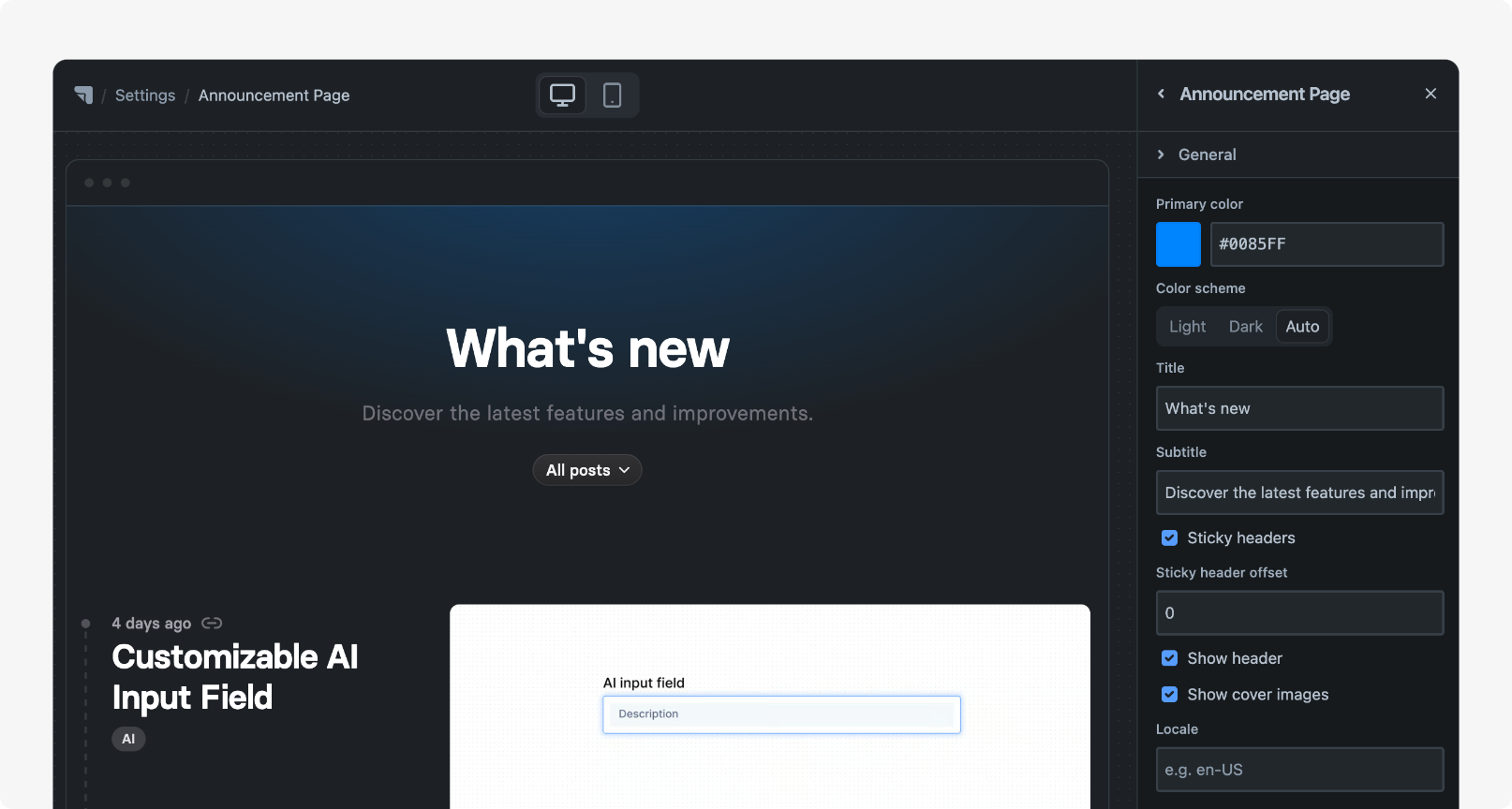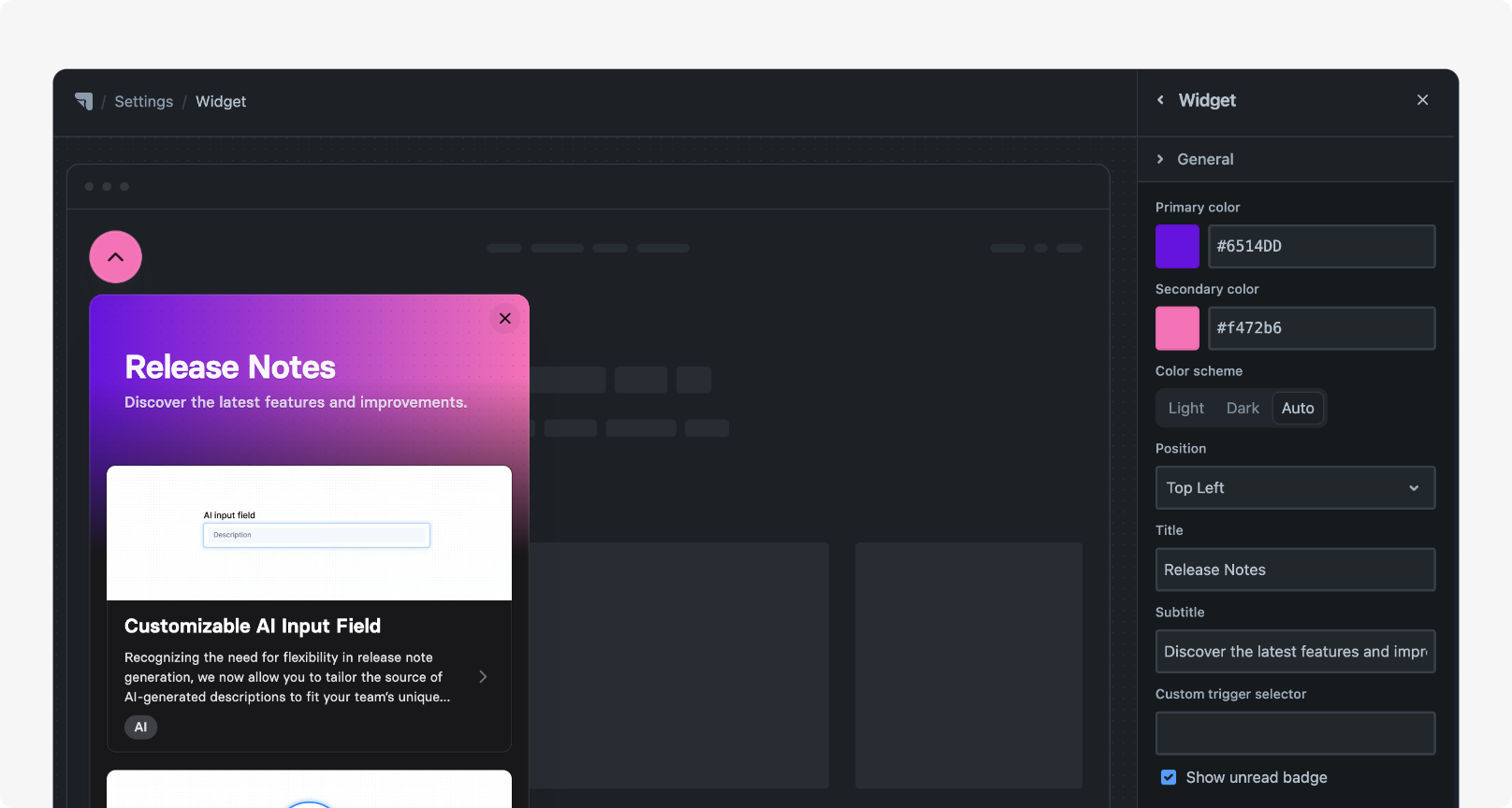
Think of a portal as your dedicated space to communicate with a particular audience.
Appearance matters—that’s why we’ve created two stunning themes that you can customize to match your brand, making the portal unmistakably yours.
Managing access
Section titled “Managing access”Control who can access your portal via ⚙ Settings > Access in your workspace.
Settings
Section titled “Settings”Themes
Section titled “Themes”Hub offers two distinct themes for your Product Hub and portals. Choose your preferred theme in the Product Hub settings, and it will be applied to all portals.
Sydney
Section titled “Sydney”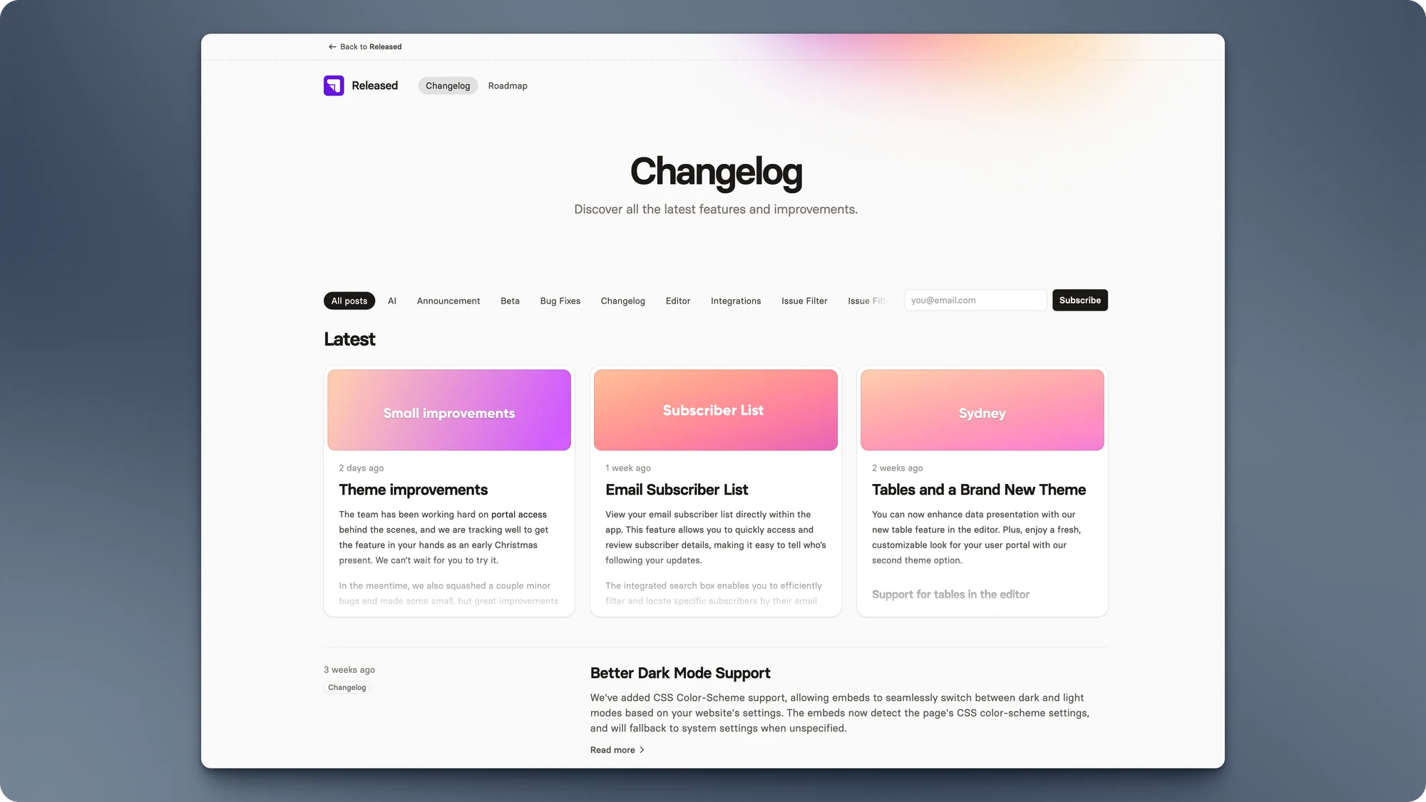
San Francisco
Section titled “San Francisco”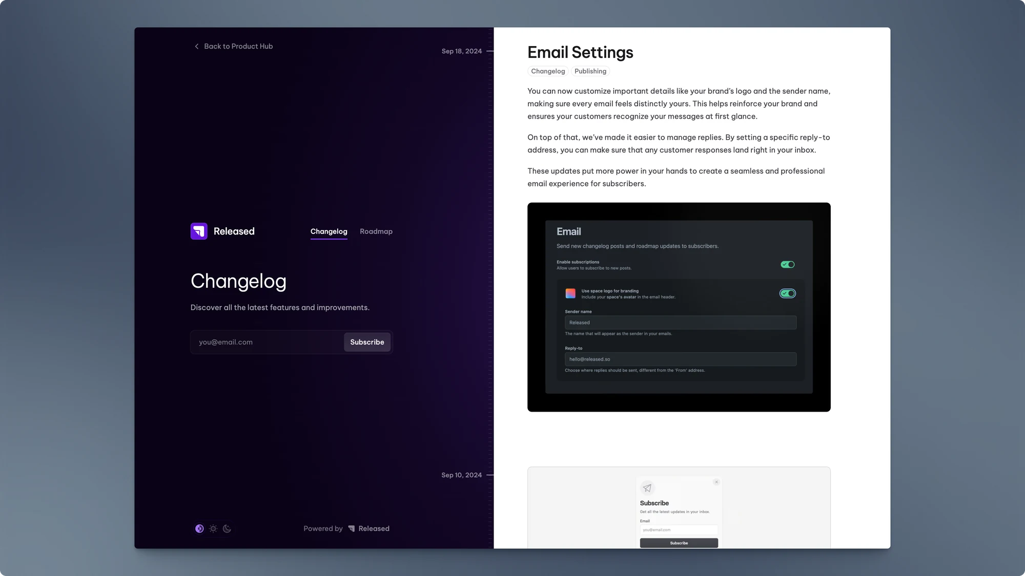
General
Section titled “General”The General Settings let you customize your portal’s appearance, content, and display language. Here are the available configuration options:
| Setting | Description |
|---|---|
| Modules | Select which modules to display in the portal.
|
| Color scheme | Choose the color scheme for the interface.
See configuring-dark-mode.md for more details. |
| Primary color | Select the primary color for the interface by entering a hex color code or choosing a color from the color picker. This color is used for highlights and accents. |
| Changelog title | Enter the title for the Changelog module. This title will appear as the main heading for the changelog section. |
| Changelog subtitle | Enter a subtitle for the Changelog module. This description provides additional context for the changelog section. |
| Roadmap title | Enter the title for the Roadmap module. This title will appear as the main heading for the roadmap section. |
| Roadmap subtitle | Enter a subtitle for the Roadmap module. This description provides additional context for the roadmap section. |
| Locale | Select the language for the interface. Choose from available language options to set the preferred locale. 🇺🇸 American English |
Portal
Section titled “Portal”Depending on the selected theme, you may see Portal specific settings. Here are the available configuration options:
| Setting | Description |
|---|---|
| Secondary color | The secondary color used for gradients in the Sydney theme. |
Embedding the portal
Section titled “Embedding the portal”Use the embeds to integrate the content of a portal seamlessly into your website or app.
Embeds come in two forms. A full page embed and a popup widget.
| Page Embed | announcement-page.md | Announcement Page - Header.png |
| Widget embed | widget.md | Widget - Header.png |