

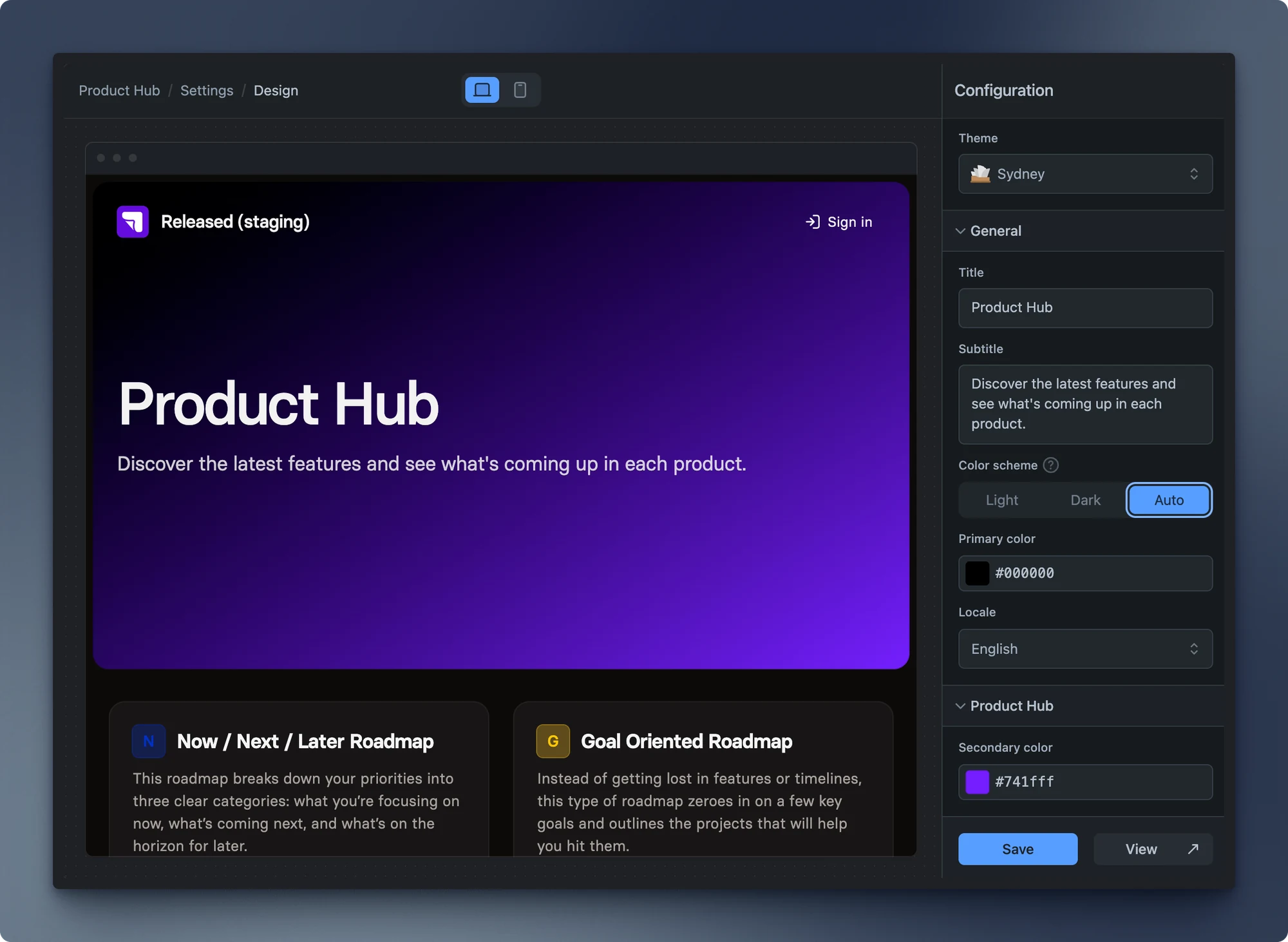
Design settings control the shared visual language of your Product Hub and portals. Choose a theme first, then set the title, supporting copy, colours, and display language that visitors see. This lets you make the published experience feel like part of your product without changing the underlying portal content.
Basics
Section titled “Basics”Themes
Section titled “Themes”Hub offers two themes for the Product Hub and its portals. Your selection applies to all portals, so choose the layout that best suits the way you present updates and roadmaps before refining colours and copy.
Sydney
Section titled “Sydney”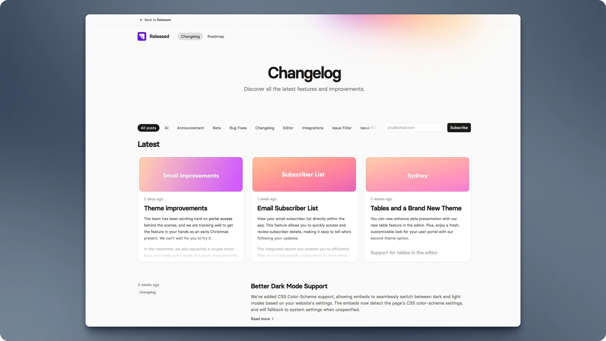
San Francisco
Section titled “San Francisco”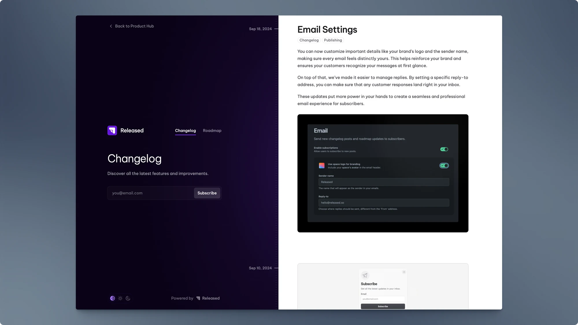
General
Section titled “General”After choosing a theme, use the general settings to configure the shared appearance, content, and display language. Each option affects the public-facing Product Hub rather than a single post or roadmap.
| Setting | Description |
|---|---|
| Title | Enter the title for the Product Hub. This title will appear as the main heading on the Product Hub overview page. |
| Subtitle | Enter a subtitle for the Product Hub. This description provides additional context for viewers. |
| Color scheme | Choose the color scheme for the interface.
|
| Primary color | Select the primary color for the interface by entering a hex color code or choosing a color from the color picker. This color is used for highlights and accents. |
| Locale | Select the language for the interface. Choose from available language options to set the preferred locale. |
Theme-specific settings
Section titled “Theme-specific settings”Some controls only appear for a particular theme. For example, Sydney includes a secondary colour that is used in its gradients. If you change theme later, review the settings again: a colour or layout option that applied to the old theme may not apply to the new one.
| Setting | Description |
|---|---|
| Secondary color | The secondary color used for gradients in the Sydney theme. |