# Design

<figure><img src="https://1499735372-files.gitbook.io/~/files/v0/b/gitbook-x-prod.appspot.com/o/spaces%2FCU5VgN3YVTfigwSnbdbk%2Fuploads%2FwK0x8ypr7HoPeb6XpQoz%2FReleased%20Settings%20-%20Design.png?alt=media&#x26;token=76e04eb3-20fd-4afa-9049-edb0845a2b53" alt=""><figcaption><p>
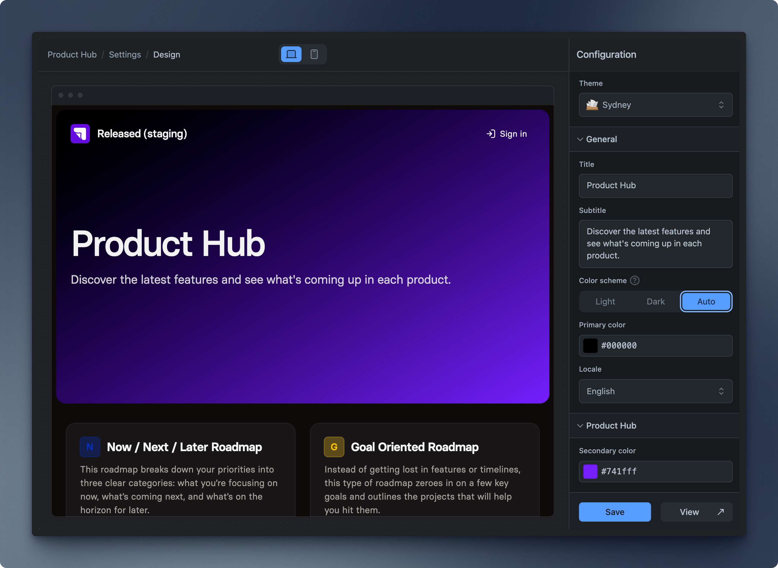
Product Hub Design Settings</p></figcaption></figure>

Customize the Product Hub to match your brand.&#x20;

Appearance matters—that’s why we’ve created two stunning themes that you can customize to match your brand, making the portal unmistakably yours.

## Basics

### Themes

Released offers two distinct themes for your Product Hub and portals. Choose your preferred theme in the Product Hub settings, and it will be applied to all portals.&#x20;

#### Sydney

<figure><img src="https://1499735372-files.gitbook.io/~/files/v0/b/gitbook-x-prod.appspot.com/o/spaces%2FCU5VgN3YVTfigwSnbdbk%2Fuploads%2Fn89vMK3cjLbSLkKDTW0W%2FTheme%20-%20Sydney.png?alt=media&#x26;token=45b6185d-d8a9-4826-a25d-276d7c92dbdd" alt=""><figcaption><p>A beautiful portal layout, featuring a slick changelog with "recently featured" and a horizontal roadmap. </p></figcaption></figure>

#### San Francisco

<figure><img src="https://1499735372-files.gitbook.io/~/files/v0/b/gitbook-x-prod.appspot.com/o/spaces%2FCU5VgN3YVTfigwSnbdbk%2Fuploads%2FYmshzG1tEKl5z8j9gVfk%2FTheme%20-%20San%20Francisco.png?alt=media&#x26;token=b060de7a-71ec-43a7-8420-9178988ec163" alt=""><figcaption><p>A modern side-by-side layout featuring a continuous changelog timeline and a vertical roadmap layout. </p></figcaption></figure>

### General

The General Settings let you customize your Product Hub's appearance, content, and display language. Here are the available configuration options:

{% hint style="info" %}
Unless overridden, the portal settings are inherited by the embedded views, including both the page and the widget.
{% endhint %}

<table><thead><tr><th width="246">Setting</th><th>Description</th></tr></thead><tbody><tr><td><strong>Title</strong></td><td>Enter the title for the Product Hub. This title will appear as the main heading on the Product Hub overview page. </td></tr><tr><td><strong>Subtitle</strong></td><td>Enter a subtitle for the Product Hub. This description provides additional context for viewers. </td></tr><tr><td><h4>Color scheme</h4></td><td><p></p><p>Choose the color scheme for the interface.</p><ul><li><strong>Light</strong>: Sets the interface to a light color theme.</li><li><strong>Dark</strong>: Sets the interface to a dark color theme.</li><li><strong>Auto</strong>: Automatically adjusts the color scheme based on the user’s system preferences.</li></ul></td></tr><tr><td><strong>Primary color</strong></td><td>Select the primary color for the interface by entering a hex color code or choosing a color from the color picker. This color is used for highlights and accents.</td></tr><tr><td><strong>Locale</strong></td><td>Select the language for the interface. Choose from available language options to set the preferred locale.</td></tr></tbody></table>

### **Portal Hub**

Depending on the selected theme, you may see Product Hub theme specific settings. Below are some of the available configuration options you may encounter:

<table><thead><tr><th width="246">Setting</th><th>Description</th></tr></thead><tbody><tr><td><strong>Secondary color</strong></td><td>The secondary color used for gradients in the Sydney theme.</td></tr></tbody></table>
